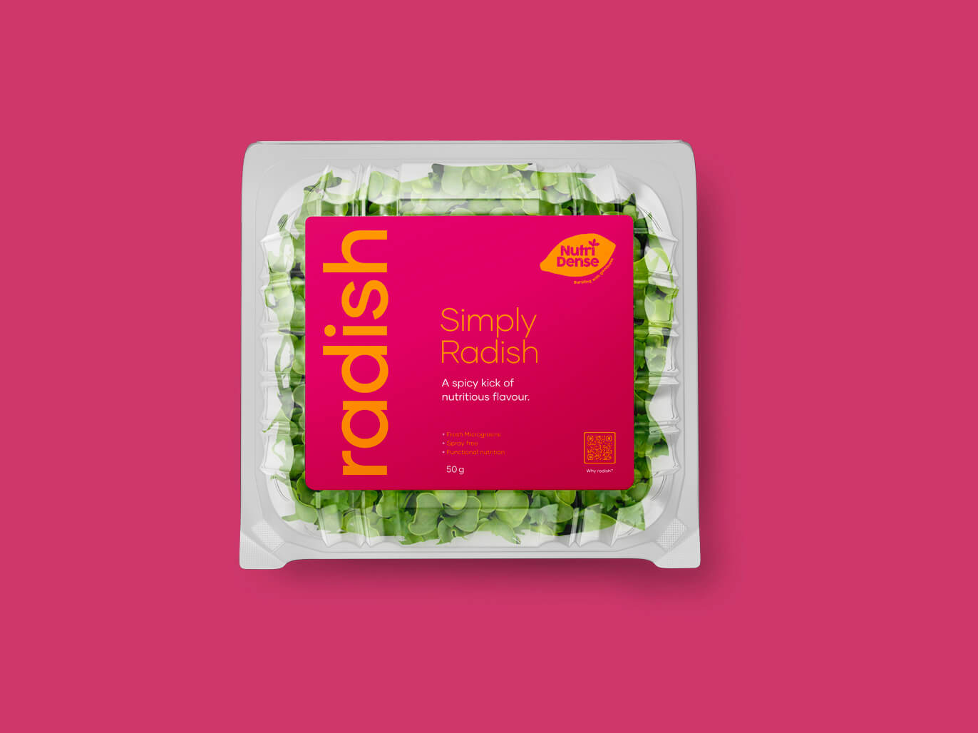
A fun re-brand that adds some colour and energy to standard supermarket greens
Nutridense


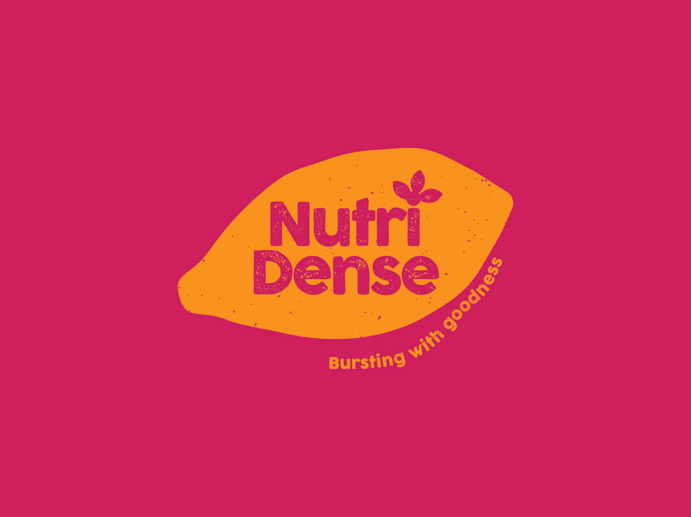
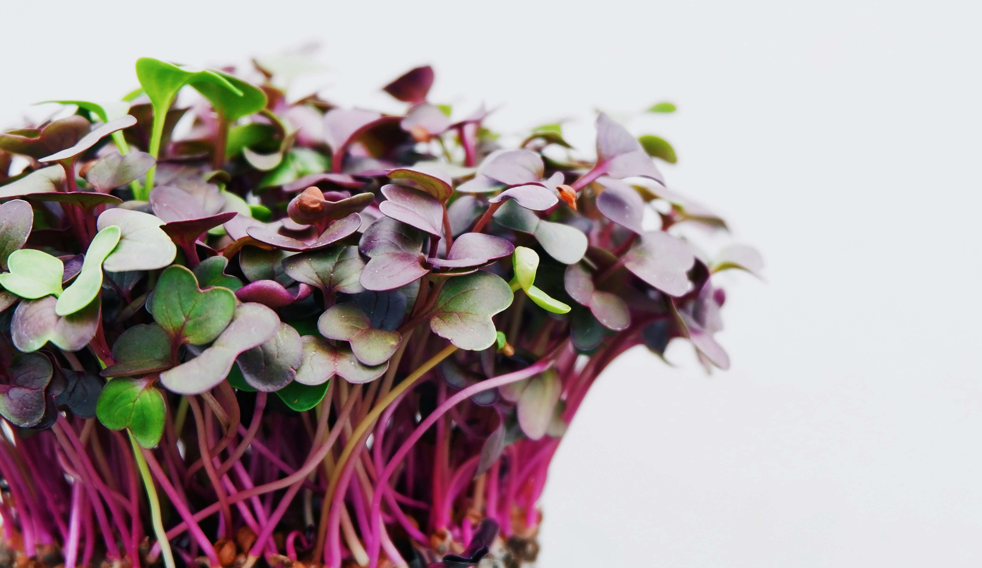
NutriDense is anchored in the conviction that good health is fundamentally tied to good food. They are dedicated to delivering superior quality products, cultivated with precision and care. Leveraging modern practices and technology, they ensure their offerings are not only free from harmful chemicals but also abundant in essential nutrients. Their products are more than just grown – they are meticulously nurtured, resulting in microgreens that are vibrant, flavourful, and densely packed with nutrients.
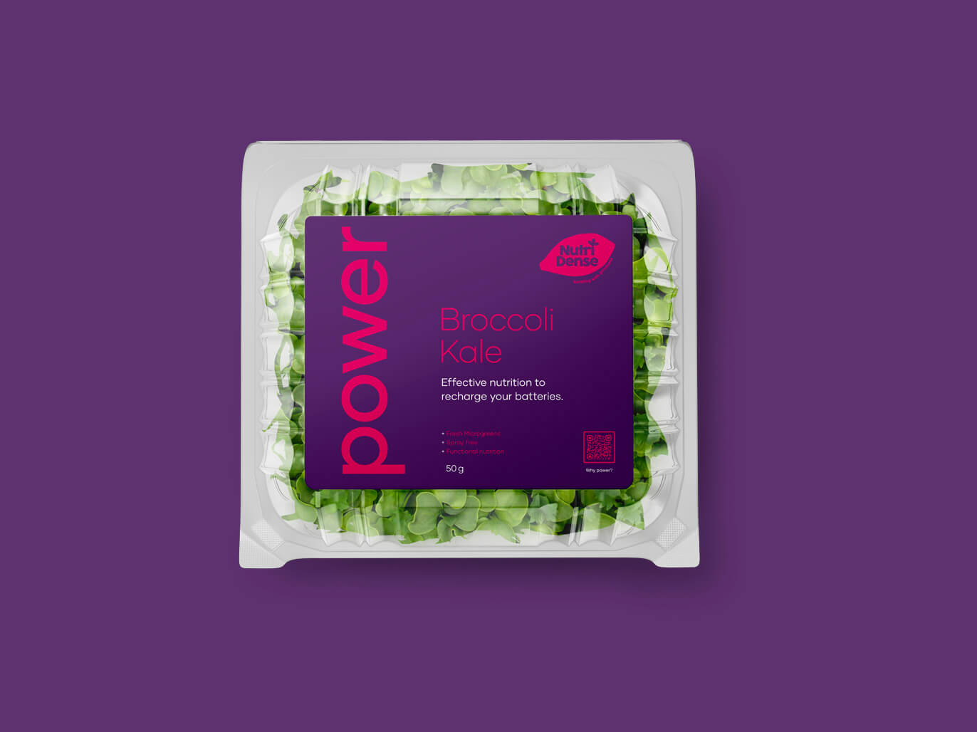
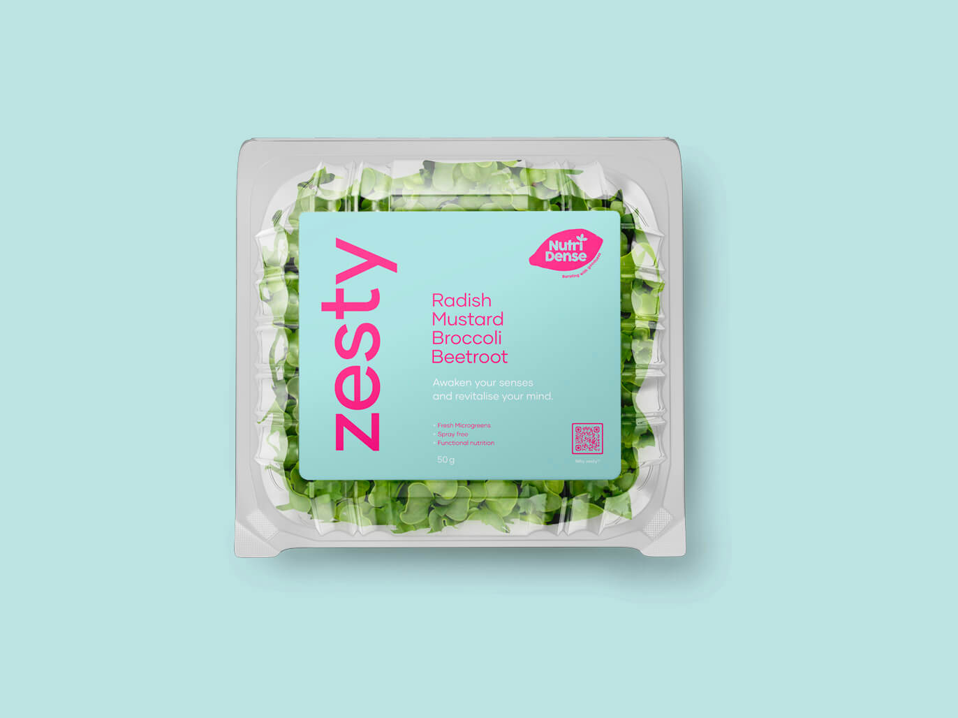
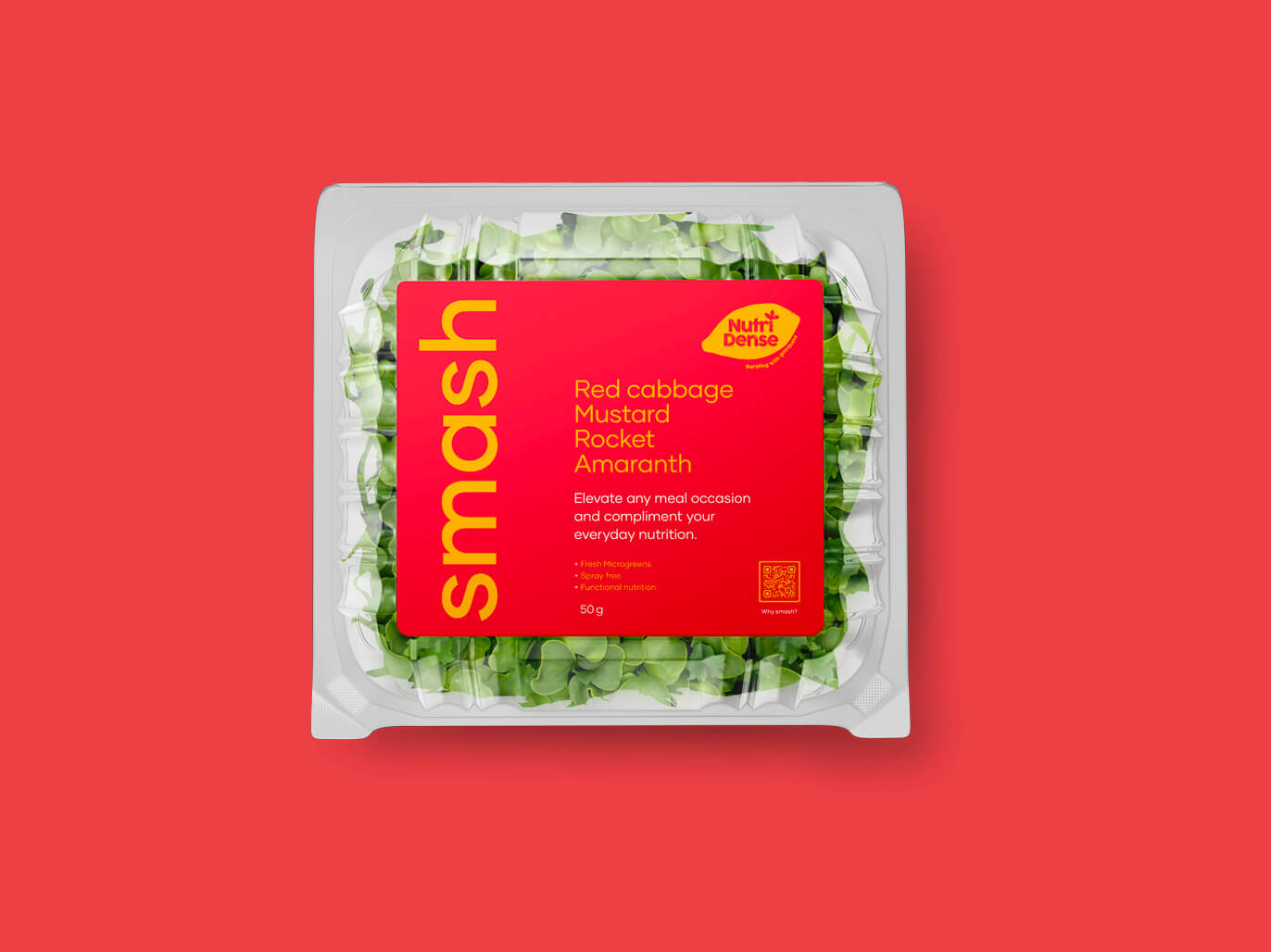
We had two purposes here; to re-brand the existing NutriDense identity, making it feel more closely aligned with its parent company Treehouse Foods, and to make Microgreens look much more fun to the average supermarket consumer. The result is an identity packed with colour and vibrancy, much like the greens themselves.
CLIENT
Treehouse Foods
INDUSTRY
Fresh produce
SERVICES
Brand refresh
Brand development
Logo design
Graphic design

Let’s talk branding
Our approach: Going backwards before moving forward.
