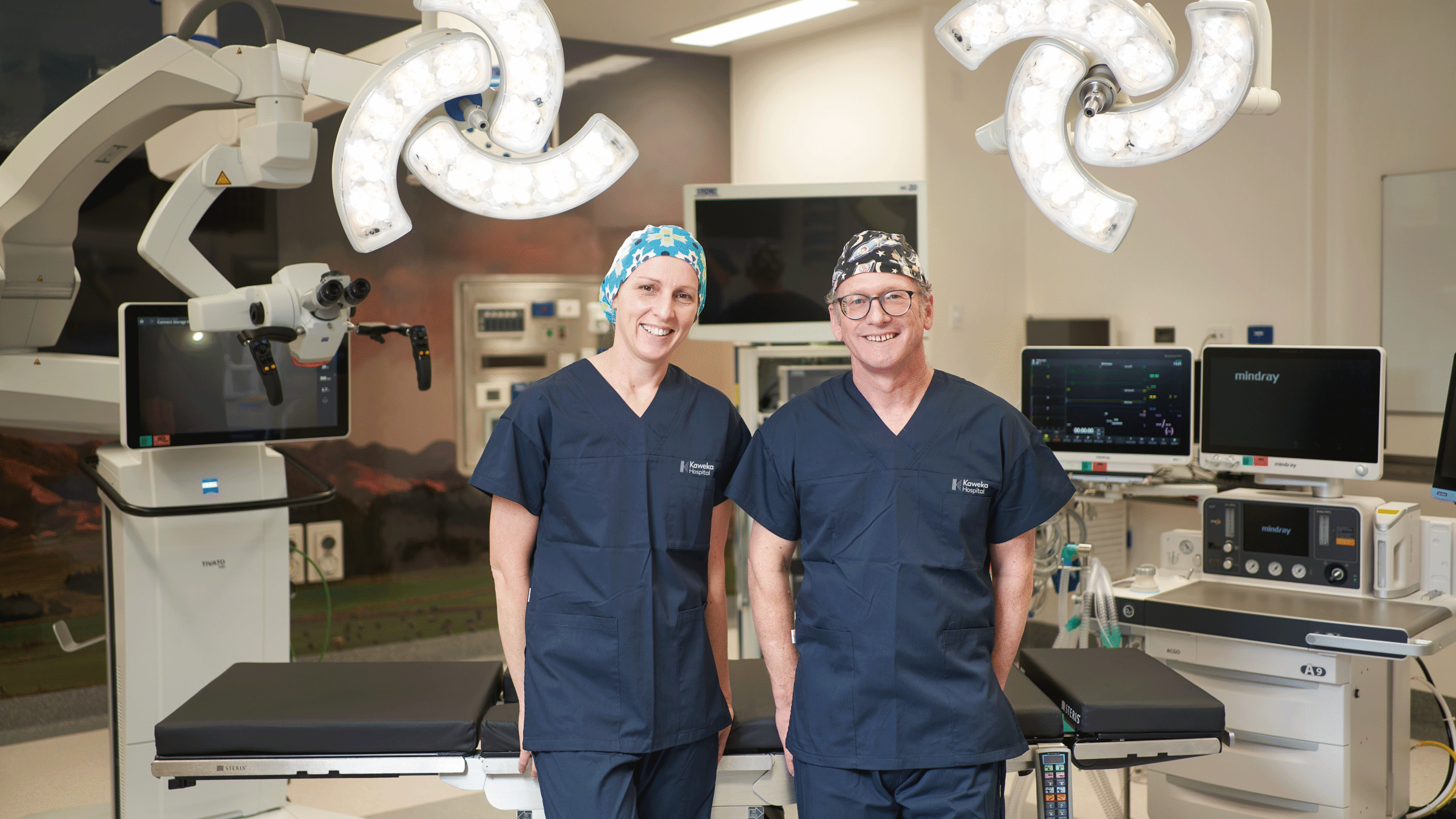
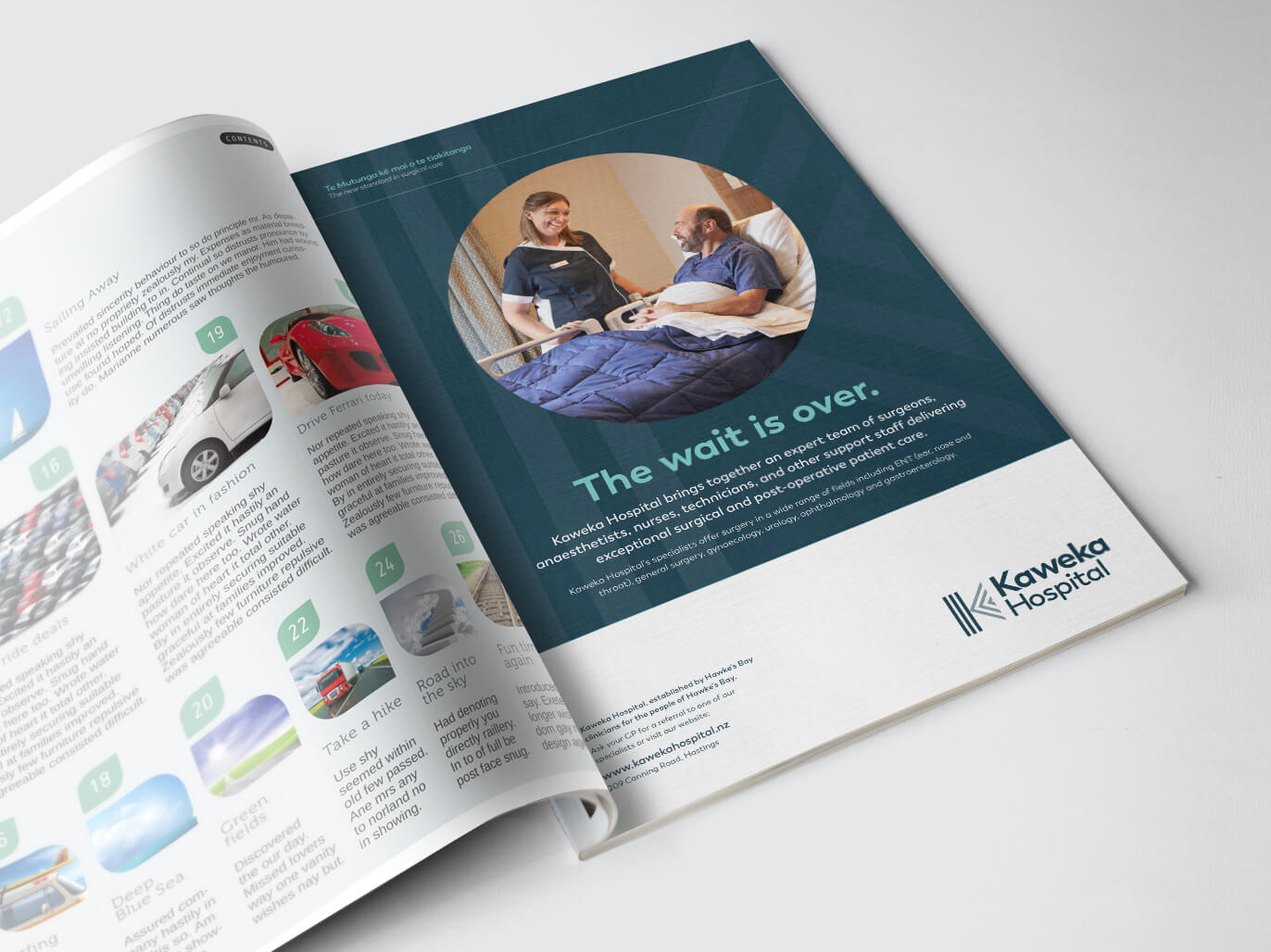
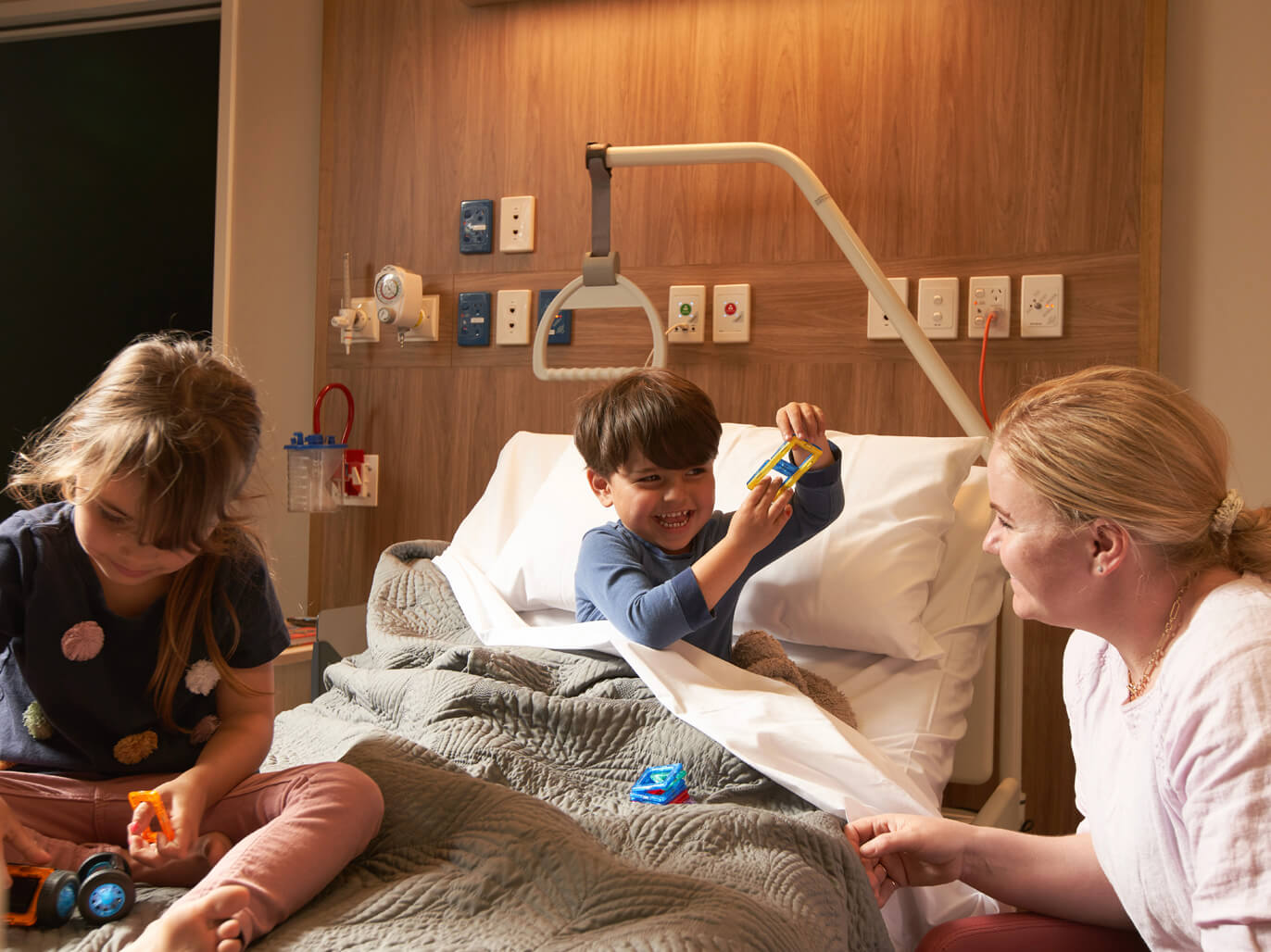
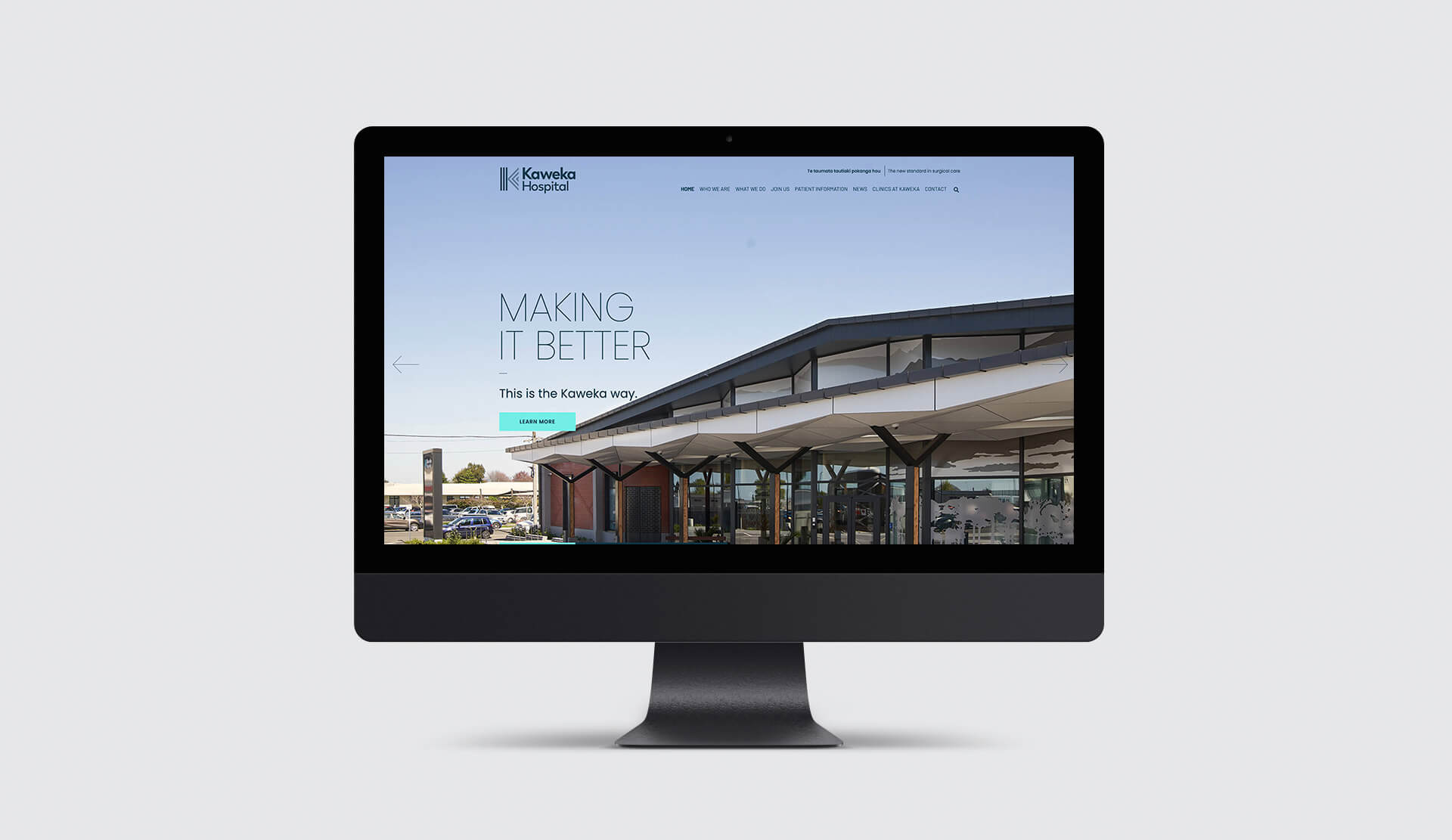
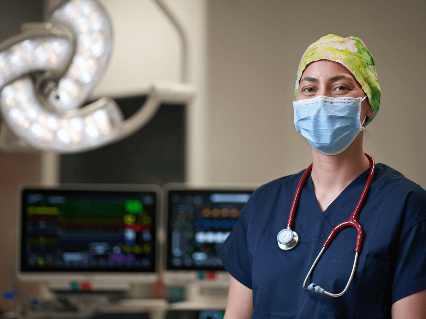
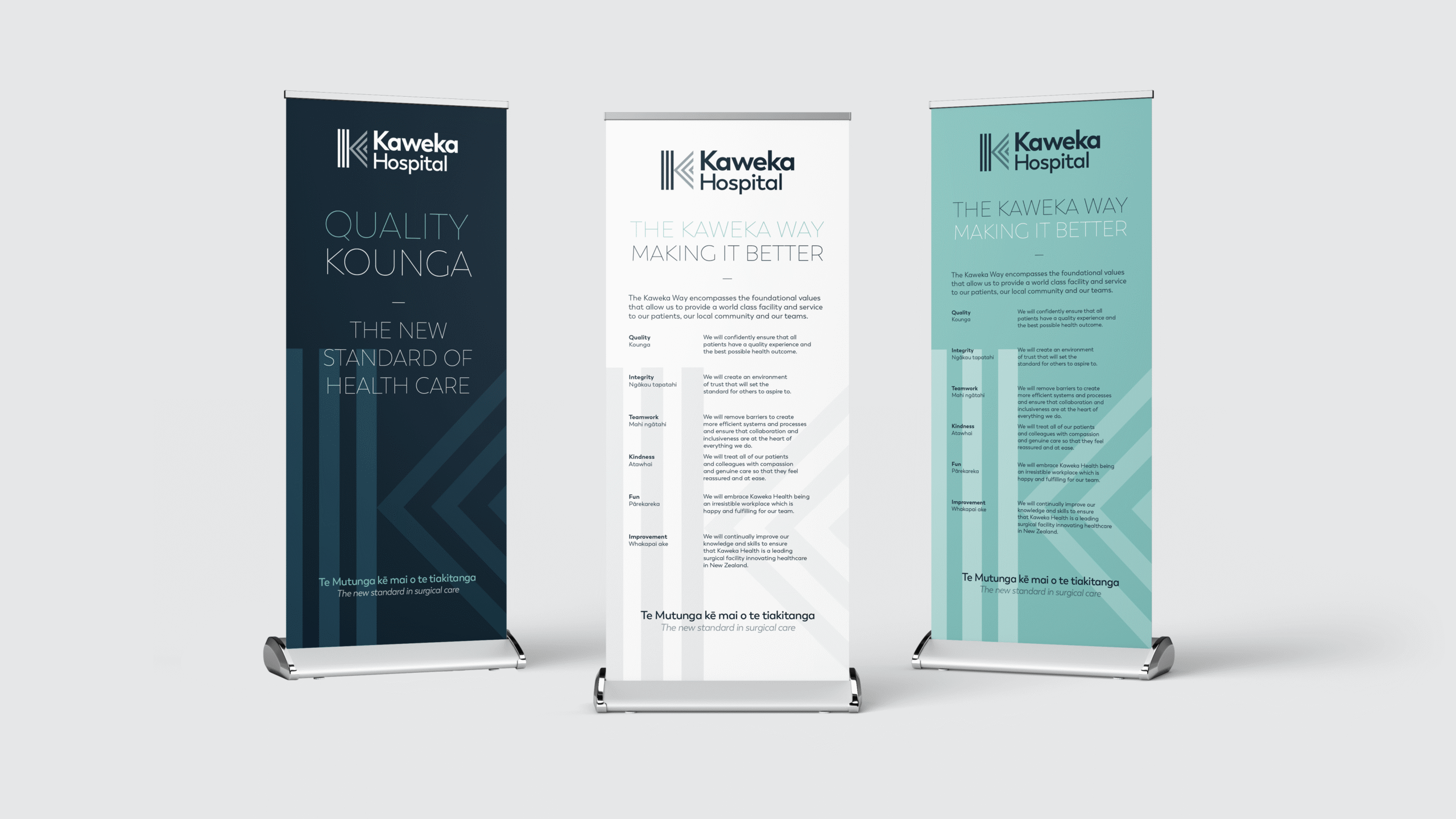
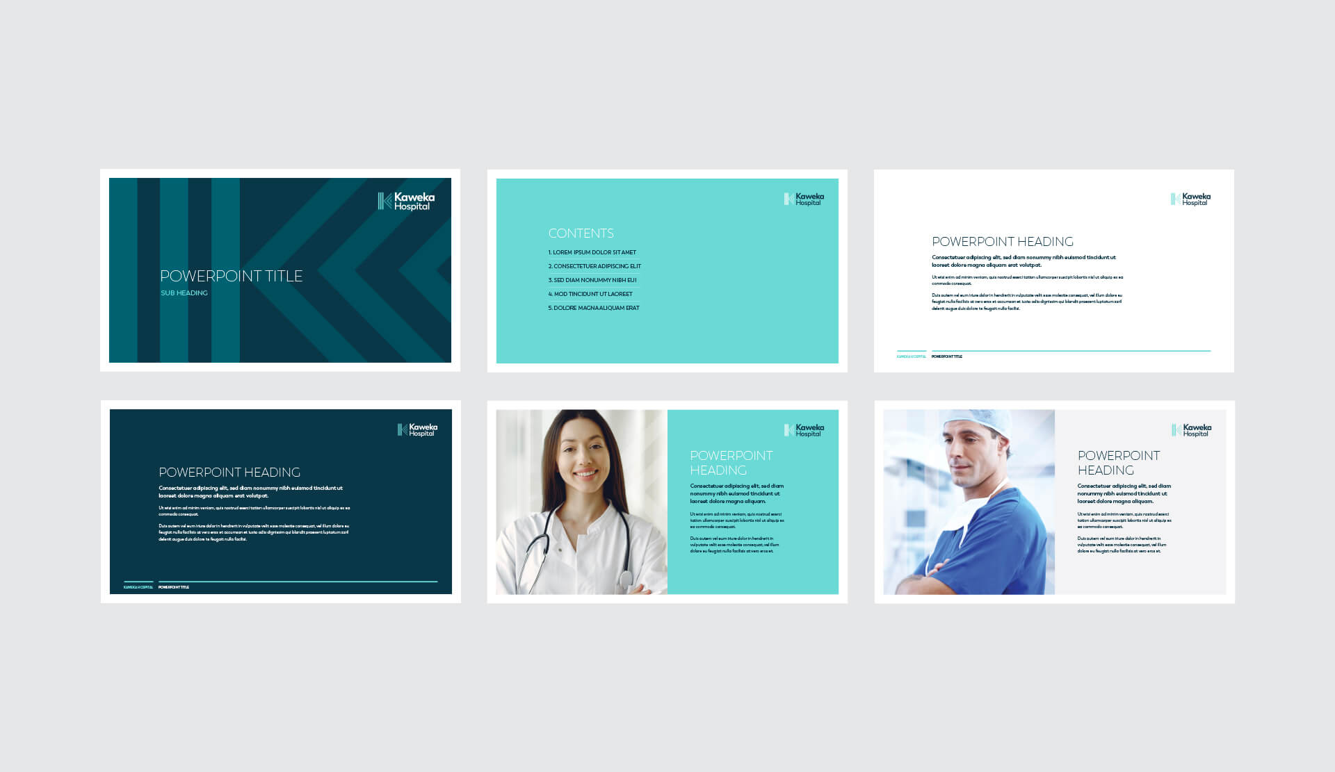
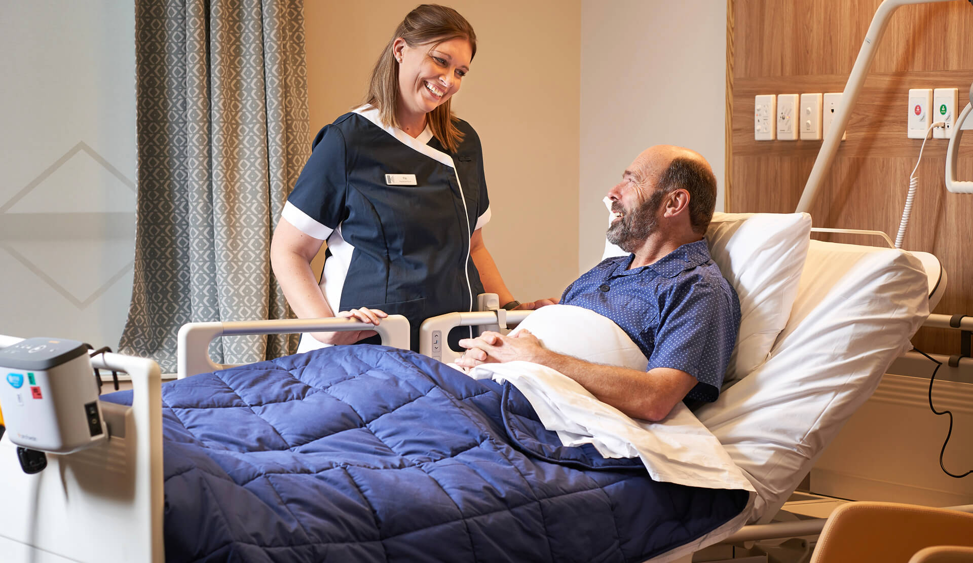
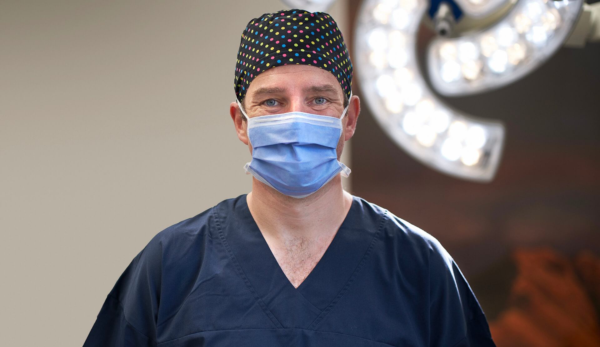
Kaweka Hospital brings together an expert team of surgeons, anaesthetists, nurses, technicians, and other support staff to deliver exceptional surgical and post-operative patient care. Kaweka Hospital’s specialists offer surgery in a wide range of fields including ENT (ear, nose and throat), general surgery, gynaecology, urology, ophthalmology and gastroenterology.
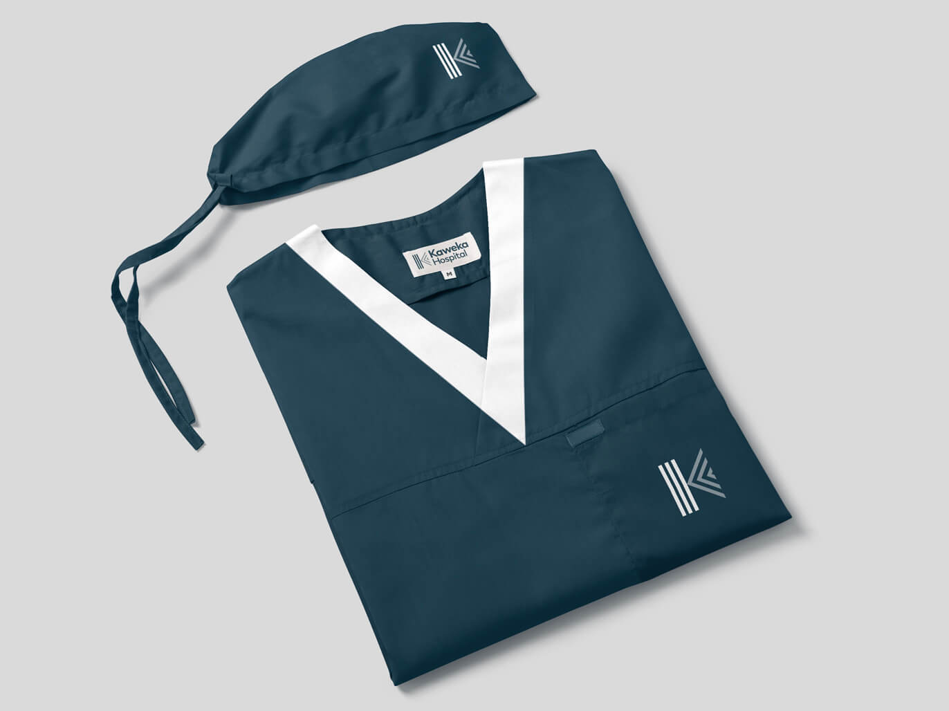
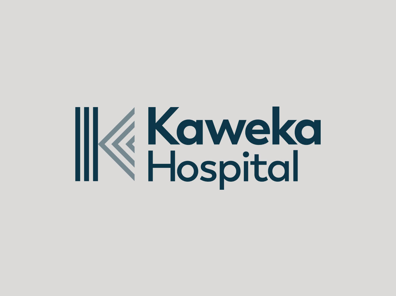
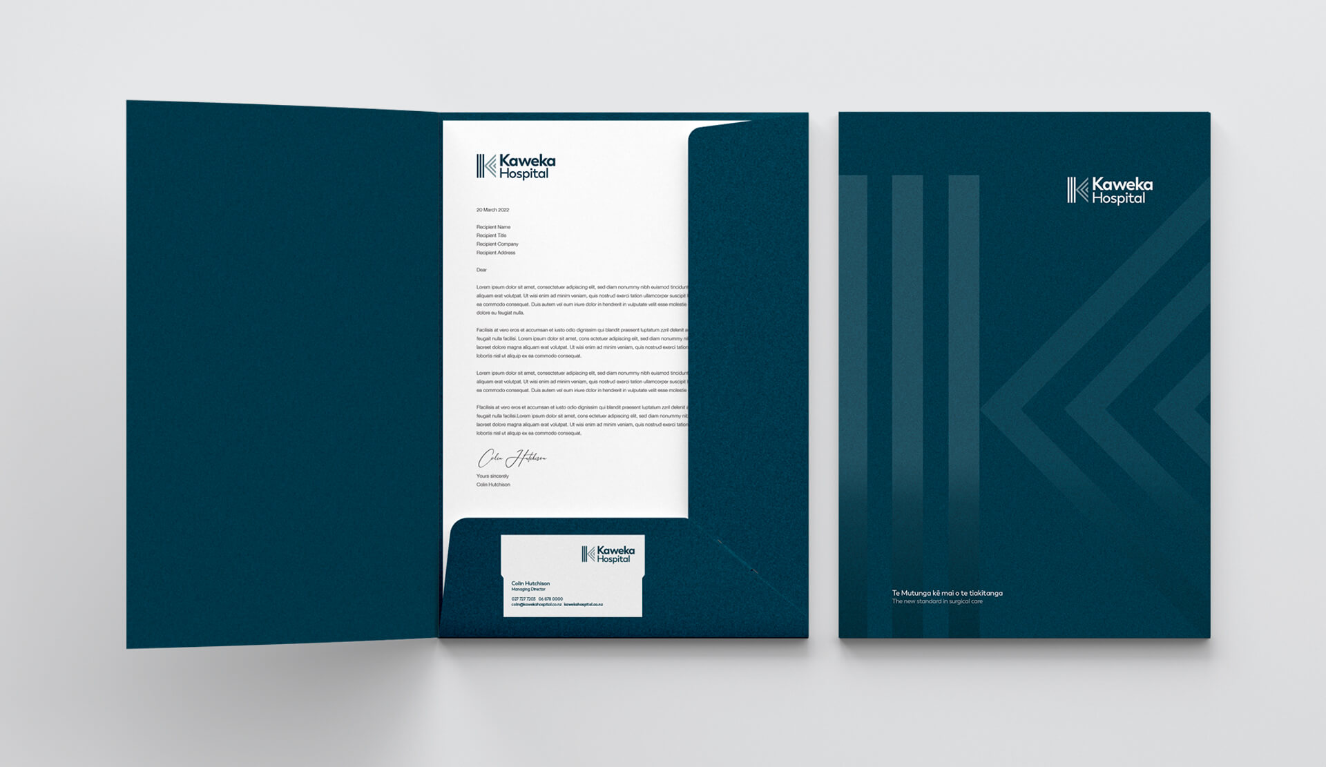
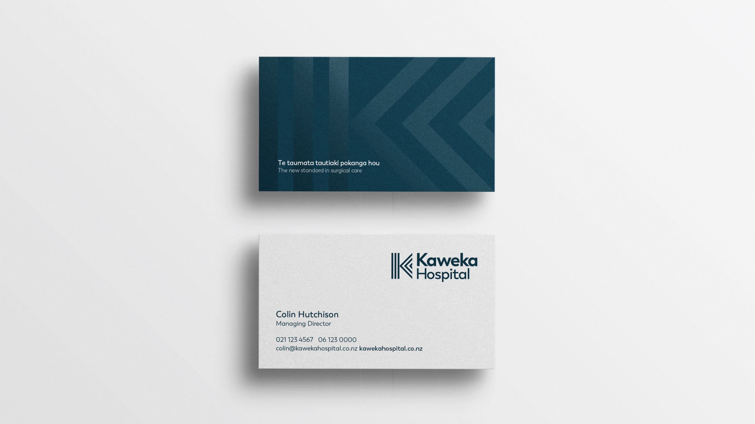
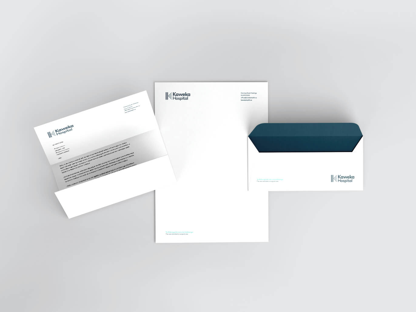
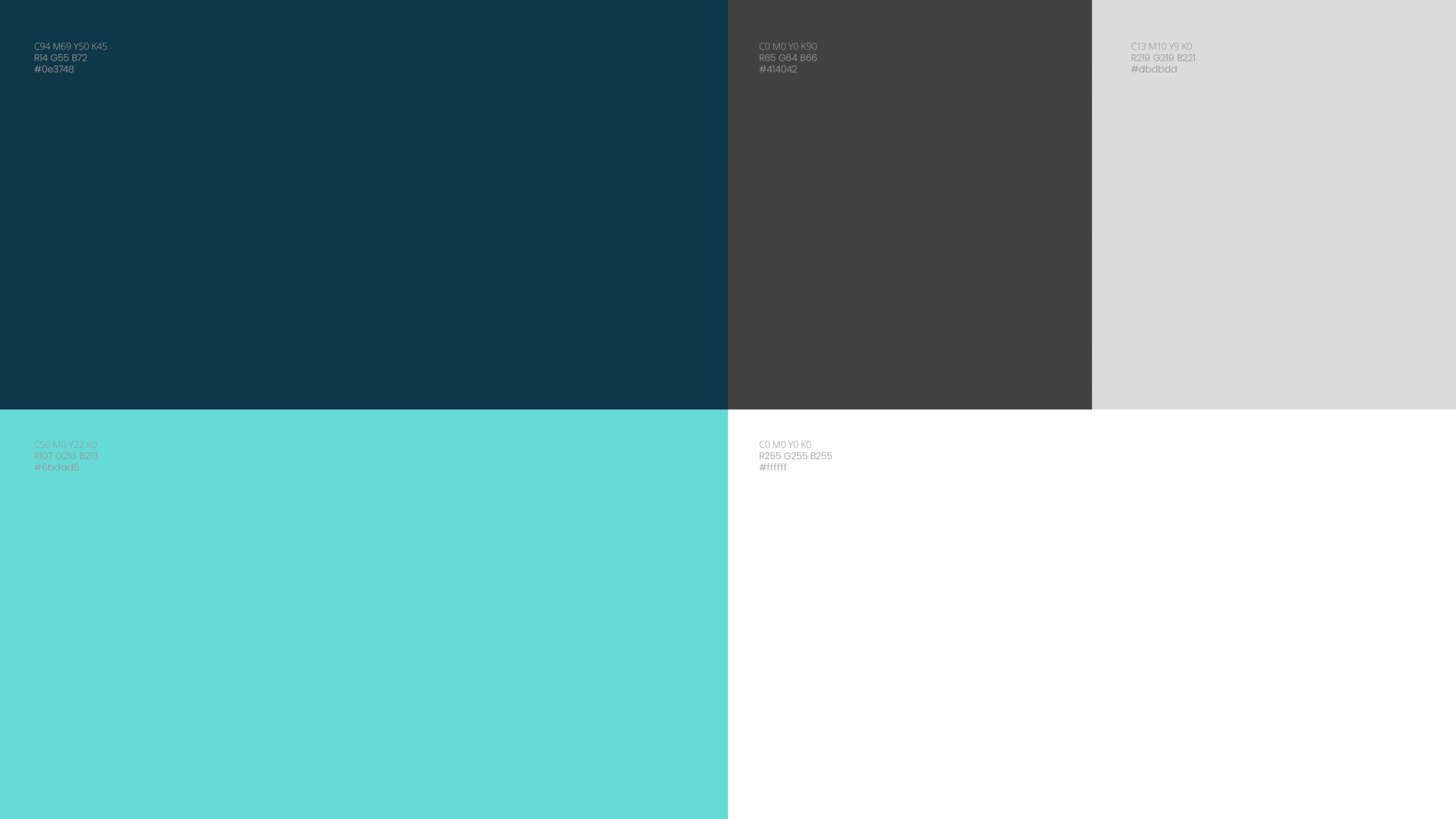
Logotype + design Kaweka required a brand identity that would encapsulate both the hospital, the area in which it is located and the strong Māori connection .
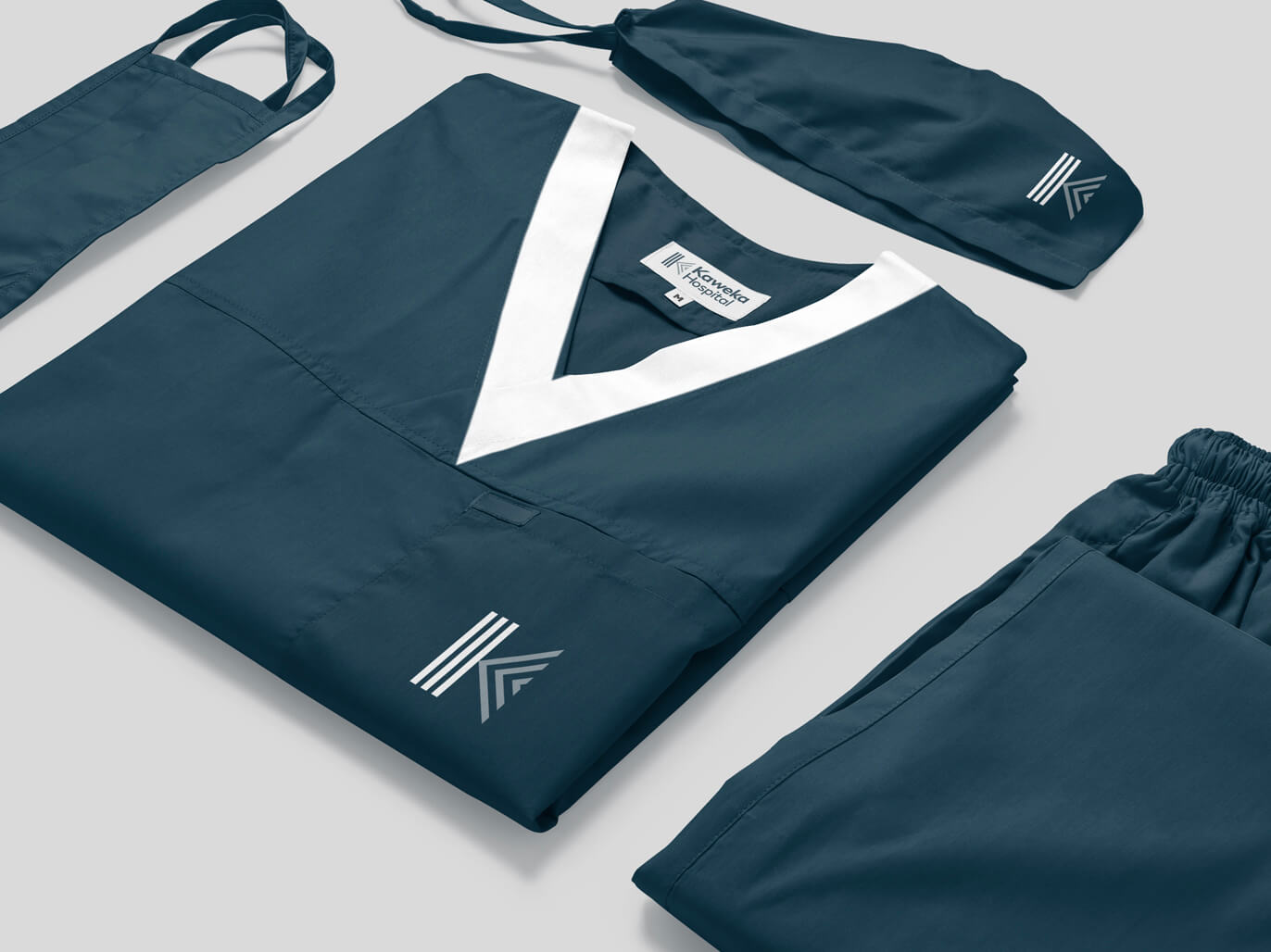
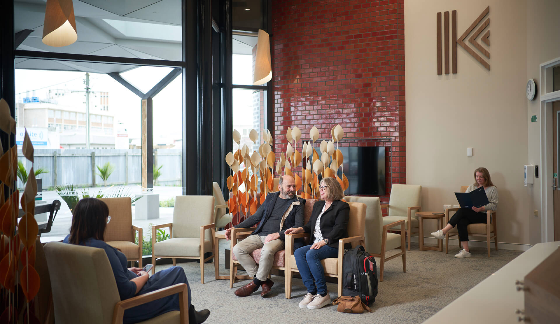
The stylized ‘K’ of our brand mark is representative of our people, our land and our region. The symbol of tuakana-teina, which refers to the relationship between an older person (tuakana) and a younger person (teina), drawn from Te Ao Māori – the Māori world. The Kaweka Ranges has three main awa (rivers) Tūtaekurī, Mōhaka, and Ngaruroro. Therefore this logo also represents the three awa (rivers) flowing past the maunga of Kaweka. The maunga represents the whare (the hospital), and the three lines represent our people (Kaweka Staff and board), our Shareholders and partners and our community, he tangata, the people.
CLIENT Kaweka Hospital
INDUSTRY Healthcare
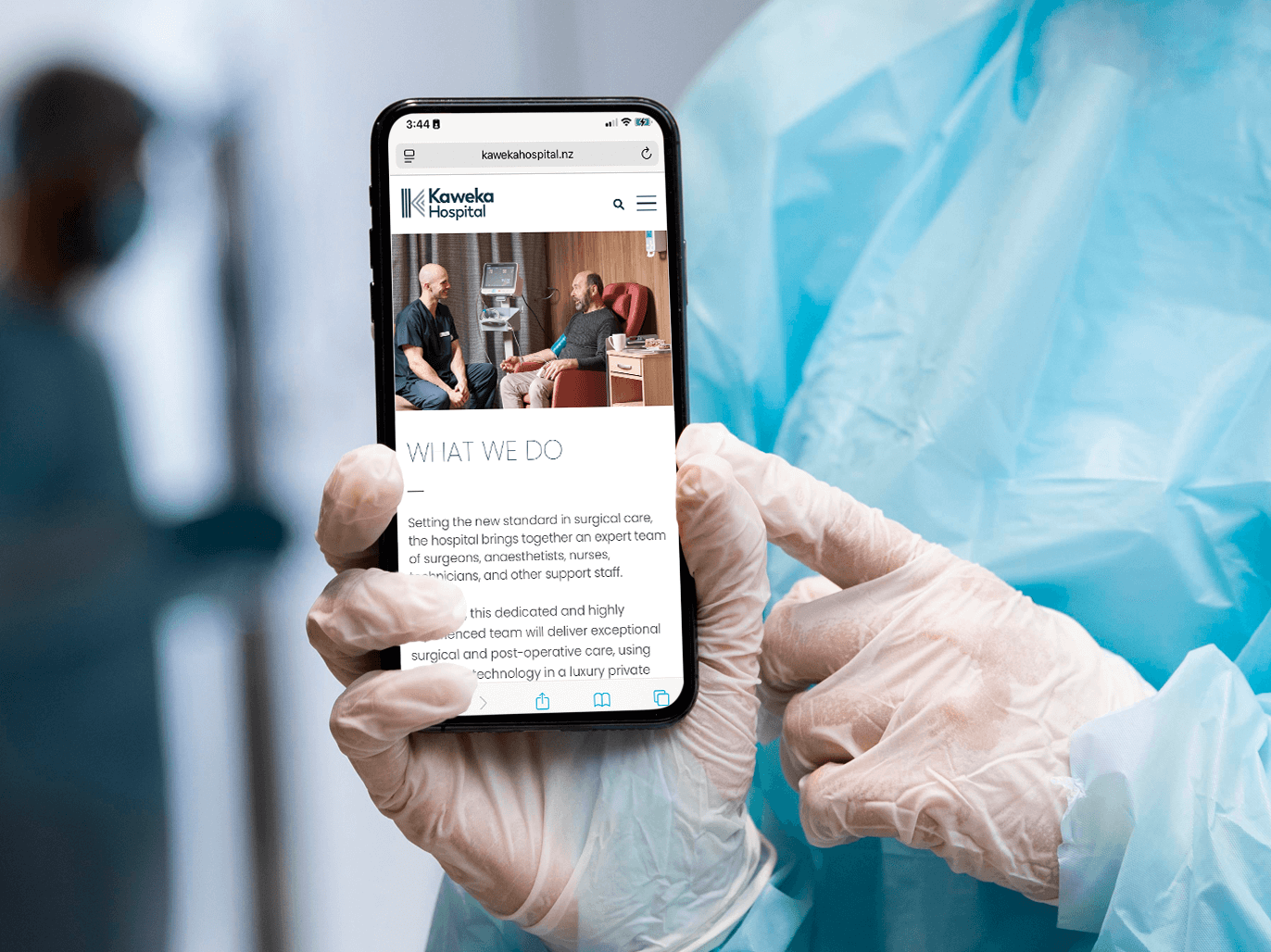
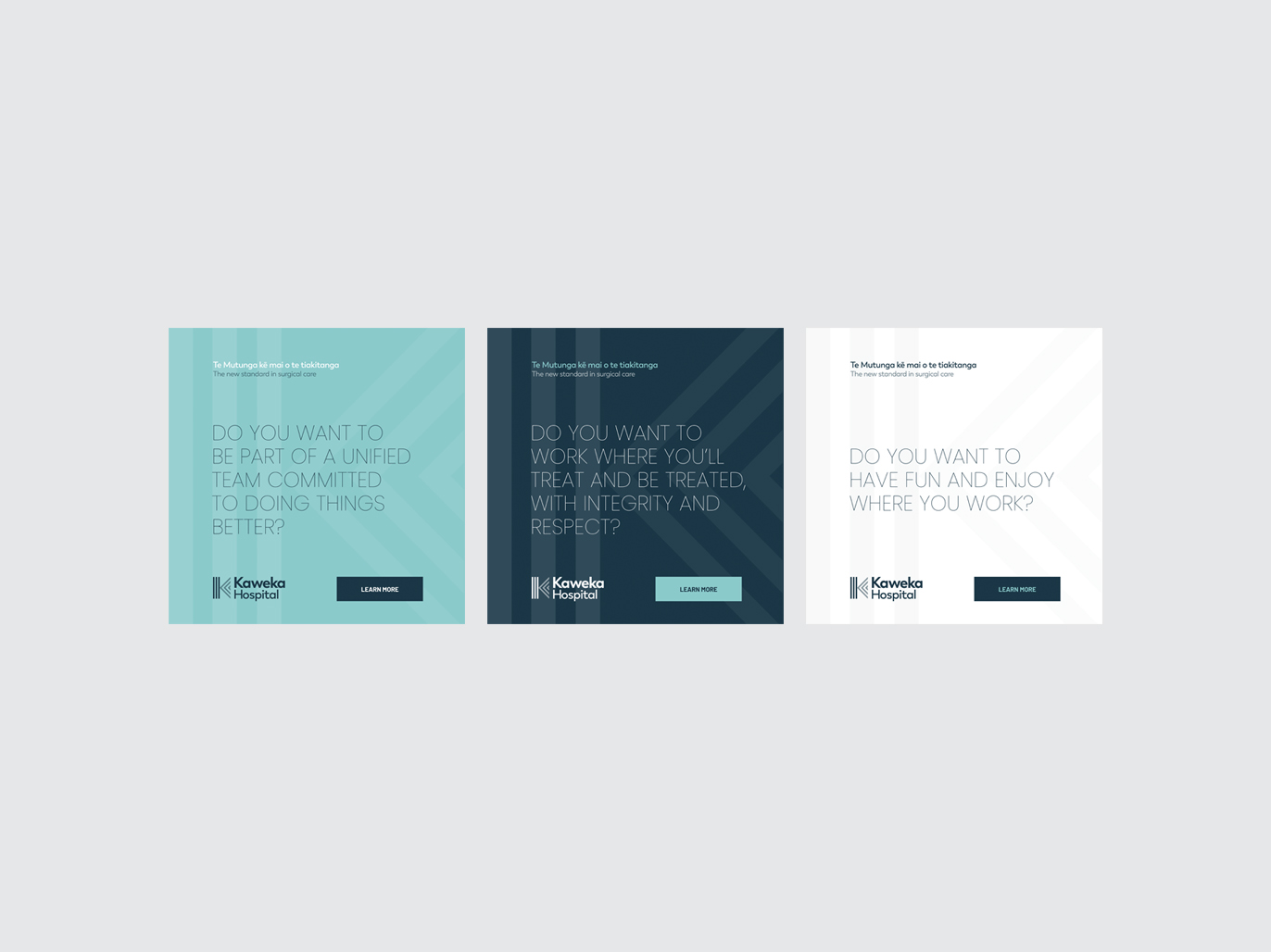
SERVICES Brand Discovery session Brand development Logo design Graphic design Print design Photography Digital design Website design
WEBSITE kawekahospital.nz
Scroll to Top
Let's talk branding
Whatever your brand or graphic design challenge, we can help.